styled()
用於建立樣式化組件的工具。
簡介
所有 Material UI 組件都使用 styled() 工具進行樣式化。此工具建立於 @mui/styled-engine 的 styled() 模組之上,並提供額外功能。
匯入路徑
您可以使用來自 @mui/system 套件的工具,或者如果您使用 @mui/material,您可以從 @mui/material/styles 匯入。差異在於使用的預設 theme (如果 React 上下文中沒有可用的主題)。
import { styled } from '@mui/system';
// If you are using @mui/material
import { styled } from '@mui/material/styles';
它解決了哪些問題?
此工具可以用作 emotion 或 styled-components 的 styled() 工具的替代品。它的目標是解決相同的問題,但也提供以下優勢
- 如果 React 上下文中沒有可用的主題,它會使用預設的
theme。 - 它支援主題的
styleOverrides和variants,根據選項中套用的name應用 (可以省略)。 - 它預設新增對
sxprop 的支援 (可以省略)。 - 它預設新增
shouldForwardProp選項 (可以覆寫),考量到:ownerState、theme、sx和as。
API
styled(Component, [options])(styles) => Component
參數
Component:將被包裝的組件。options(object [選填])options.shouldForwardProp((prop: string) => bool[選填]):指示是否應將prop轉發到Component。options.label(string [選填]):樣式表的後綴。用於除錯。options.name(string [選填]):在theme.components下用於指定styleOverrides和variants的鍵。也用於產生label。options.slot(string [選填]):如果為Root,則自動套用主題的variants。options.overridesResolver((props: object, styles: Record<string, styles>) => styles [選填]):根據 props 和theme.components[name].styleOverrides物件傳回樣式的函式。options.skipVariantsResolver(bool):停用theme.components[name].variants的自動解析器。options.skipSx(bool [選填]):在組件上停用sxprop。- 其他鍵會轉發到 emotion 的
styled([Component], [options])的options參數。
styles(object |({ ...props, theme }) => object[選填]):樣式物件或傳回樣式物件的函式。該函式接收主題和組件的 props 在一個物件中,這是它的單一參數。
傳回
Component:建立的新組件。
基本用法
自訂組件
此範例示範如何使用 styled API 建立自訂組件,其功能與核心組件相同
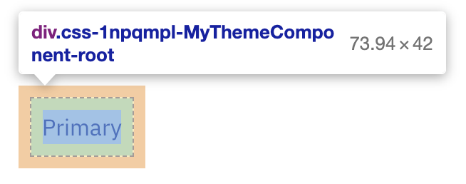
如果您在開發模式下使用瀏覽器 DevTools 檢查此元素,您會注意到組件的類別現在以 MyThemeComponent-root 結尾,這來自提供的 name 和 slot 選項。
除此之外,color、sx 和 variant props 不會傳遞到產生的 div 元素。
移除功能
如果您想移除某些 MUI 系統特定的功能,您可以這樣做
 const StyledComponent = styled('div', {}, {
   name: 'MuiStyled',
   slot: 'Root',
-  overridesResolver: (props, styles) => styles.root, // disables theme.components[name].styleOverrides
+  skipVariantsResolver: true, // disables theme.components[name].variants
+  skipSx: true, // disables the sx prop
 });
建立自訂 styled() 工具
如果您想要為 styled() 工具使用不同的預設主題,您可以使用 createStyled() 工具建立自己的版本。
import { createStyled, createTheme } from '@mui/system';

const defaultTheme = createTheme({
  // your custom theme values
});

const styled = createStyled({ defaultTheme });

export default styled;
與 sx prop 的差異
styled 函式是底層樣式庫 (Emotion 或 styled-components) 提供的 styled 工具的擴充功能。保證對於相同的輸入,它將產生與樣式庫提供的 styled 函式相同的輸出。
另一方面,sx prop 是一種新的樣式化組件方式,專注於快速自訂。styled 是一個函式,而 sx 是使用 styled 建立的組件上可用的 prop。
因此,您會注意到以下差異
sx 比 styled 提供更多捷徑
使用 styled
const MyStyledButton = styled('button')({
  mx: 1, // ❌ don't use this! This shortcut is only provided by the `sx` prop
});
使用 sx
import Button from '@mui/material/Button';

const MyStyledButton = (props) => (
  <Button
    sx={{
      mx: 1, // ✔️ this shortcut is specific to the `sx` prop,
    }}
  >
    {props.children}
  </Button>
);
樣式定義略有不同
使用 styled
const MyStyledButton = styled('button')({
  padding: 1, // means "1px", NOT "theme.spacing(1)"
});
使用 sx
import Button from '@mui/material/Button';

const MyStyledButton = (props) => (
  <Button
    sx={{
      padding: 1, // means "theme.spacing(1)", NOT "1px"
    }}
  >
    {props.children}
  </Button>
);
如何使用 props 的模式不同
使用 styled
const MyStyledButton = styled('button')((props) => ({
  backgroundColor: props.myBackgroundColor,
}));
使用 sx
import Button from '@mui/material/Button';

const MyStyledButton = (props) => (
  <Button sx={{ backgroundColor: props.myCustomColor }}>{props.children}</Button>
);
使用函式時,每個欄位的參數都不同
使用 styled (不建議)
// You may find this syntax in the wild, but for code readability
// we recommend using only one top-level function
const MyStyledButtonPropsPerField = styled('button')({
  backgroundColor: (props) => props.myBackgroundColor,
});
使用 sx
import Button from '@mui/material/Button';
import { lighten } from 'polished';

const MyStyledButton = (props) => (
  <Button
    sx={{ backgroundColor: (theme) => lighten(0.2, theme.palette.primary.main) }}
  >
    {props.children}
  </Button>
);
// Note: for direct theme access without modification, you can also use a shortcut by providing the key as a string
const MyStyledButton = (props) => (
  <Button sx={{ backgroundColor: 'primary.main' }}>{props.children}</Button>
);
如何將 sx 語法與 styled() 工具一起使用?
如果您偏好 sx 語法並想在 sx prop 和 styled() 工具中都使用它,您可以使用來自 theme 的 unstable_sx 工具
使用 unstable_sx 工具新增的額外負擔與在組件上使用 sx prop 相同。
如何使用組件選擇器 API
如果您曾經使用過 emotion 或 styled-components 的 styled() API,您應該能夠使用組件作為選擇器。
import styled from '@emotion/styled';

const Child = styled.div`
  color: red;
`;

const Parent = styled.div`
  ${Child} {
    color: green;
  }
`;

render(
  <div>
    <Parent>
      <Child>Green because I am inside a Parent</Child>
    </Parent>
    <Child>Red because I am not inside a Parent</Child>
  </div>,
);
使用 MUI 系統的 styled() 工具,您也可以使用組件作為選擇器。當使用 @mui/styled-engine-sc (styled-components) 時,無需執行任何操作。當使用 @mui/styled-engine (emotion),預設引擎時,您應執行幾個步驟
首先,您應該安裝 @emotion/babel-plugin。
npm install @emotion/babel-plugin
然後,設定外掛程式以了解 Material UI 版本的 styled() 工具
babel.config.js
module.exports = {
  ...
  plugins: [
    [
      "@emotion",
      {
        importMap: {
          "@mui/system": {
            styled: {
              canonicalImport: ["@emotion/styled", "default"],
              styledBaseImport: ["@mui/system", "styled"]
            }
          },
          "@mui/material": {
            styled: {
              canonicalImport: ["@emotion/styled", "default"],
              styledBaseImport: ["@mui/material", "styled"]
            }
          },
          "@mui/material/styles": {
            styled: {
              canonicalImport: ["@emotion/styled", "default"],
              styledBaseImport: ["@mui/material/styles", "styled"]
            }
          }
        }
      }
    ]
  ]
};
現在您應該能夠使用組件作為您的選擇器了!