文字欄位
文字欄位讓使用者輸入和編輯文字。
文字欄位允許使用者在 UI 中輸入文字。它們通常出現在表單和對話方塊中。
基本文字欄位
TextField 包裝元件是一個完整的表單控制項,包含標籤、輸入和輔助文字。它有三種變體:外框(預設)、填滿和標準。
表單屬性
支援標準表單屬性,例如 required、disabled、type 等,以及 helperText,用於提供有關欄位輸入的上下文,例如輸入將如何使用。
控制 HTML 輸入
使用 slotProps.htmlInput 將屬性傳遞到底層的 <input> 元素。
<TextField slotProps={{ htmlInput: { 'data-testid': '…' } }} />
呈現的 HTML 輸入將如下所示
<input
  aria-invalid="false"
  class="MuiInputBase-input MuiOutlinedInput-input"
  type="text"
  data-testid="…"
/>
驗證
error 屬性切換錯誤狀態。然後可以使用 helperText 屬性向使用者提供有關錯誤的回饋。
多行
multiline 屬性將文字欄位轉換為 MUI Base Textarea Autosize 元素。除非設定了 rows 屬性,否則文字欄位的高度會動態符合其內容。您可以使用 minRows 和 maxRows 屬性來限制它。
圖示
有多種方法可以在文字欄位中顯示圖示。
輸入裝飾
主要方法是使用 InputAdornment。這可用於向輸入新增前綴、後綴或動作。例如,您可以使用圖示按鈕來隱藏或顯示密碼。
公斤
公斤
重量
$
公斤
公斤
重量
$
公斤
公斤
重量
$
自訂裝飾
您可以將自訂樣式套用至裝飾,並根據另一個裝飾的屬性觸發對一個裝飾的變更。例如,以下示範使用標籤的 [data-shrink=true] 屬性,在標籤處於縮小狀態時使後綴可見(透過不透明度)。
尺寸
想要更小的輸入?請使用 size 屬性。
filled 變體輸入高度可以透過在外部呈現標籤來進一步縮減。
邊距
margin 屬性可用於變更文字欄位的垂直間距。使用 none(預設)不會將邊距套用至 FormControl,而 dense 和 normal 會套用邊距。
全寬
fullWidth 可用於使輸入佔用其容器的完整寬度。
非受控 vs. 受控
元件可以是受控或非受控的。
元件
TextField 由較小的元件(FormControl、Input、FilledInput、InputLabel、OutlinedInput 和 FormHelperText)組成,您可以直接利用它們來大幅自訂您的表單輸入。
您可能也注意到 TextField 元件中缺少一些原生 HTML 輸入屬性。這是故意的。元件會處理最常用的屬性。然後,使用者可以使用以下示範中顯示的底層元件。不過,如果您想避免一些樣板程式碼,您仍然可以使用 slotProps.htmlInput(和 slotProps.input、slotProps.inputLabel 屬性)。
顏色
color 屬性會在文字欄位取得焦點時變更其醒目提示色彩。
使用主題樣式覆寫 API
使用 styleOverrides 鍵來變更 Material UI 注入到 DOM 中的任何樣式。請參閱 主題樣式覆寫 文件以瞭解更多詳細資訊。
自訂不只侷限於 CSS。您可以使用組合來建置自訂元件,並為您的應用程式提供獨特的外觀。以下是使用 InputBase 元件的範例,其靈感來自 Google 地圖。
🎨 如果您正在尋找靈感,可以查看 MUI Treasury 的自訂範例。
useFormControl
對於進階自訂用例,公開了 useFormControl() Hook。此 Hook 會傳回父 FormControl 元件的內容值。
API
import { useFormControl } from '@mui/material/FormControl';
傳回
value (物件)
value.adornedStart(布林值):指出子Input或Select元件是否具有開始裝飾。value.setAdornedStart(函式):adornedStart狀態值的設定器函式。value.color(字串):正在使用的主題色彩,繼承自FormControlcolor屬性。value.disabled(布林值):指出元件是否以停用狀態顯示,繼承自FormControldisabled屬性。value.error(布林值):指出元件是否以錯誤狀態顯示,繼承自FormControlerror屬性value.filled(布林值):指出輸入是否已填滿value.focused(布林值):指出元件及其子元件是否以焦點狀態顯示value.fullWidth(布林值):指出元件是否佔用其容器的完整寬度,繼承自FormControlfullWidth屬性value.hiddenLabel(布林值):指出標籤是否隱藏,繼承自FormControlhiddenLabel屬性value.required(布林值):指出標籤是否指示輸入為必要輸入,繼承自FormControlrequired屬性value.size(字串):元件的尺寸,繼承自FormControlsize屬性value.variant(字串):FormControl元件及其子元件正在使用的變體,繼承自FormControlvariant屬性value.onBlur(函式):應在輸入失去焦點時呼叫value.onFocus(函式):應在輸入取得焦點時呼叫value.onEmpty(函式):應在輸入清空時呼叫value.onFilled(函式):應在輸入填滿時呼叫
範例
效能
自動填滿關鍵影格的全域樣式會在每次掛載和卸載時分別注入和移除。如果您一次載入大量文字欄位元件,則最好透過在 MuiInputBase 中啟用 disableInjectingGlobalStyles 來變更此預設行為。請務必在應用程式頂端注入自動填滿關鍵影格的 GlobalStyles。
import { GlobalStyles, createTheme, ThemeProvider } from '@mui/material';

const theme = createTheme({
  components: {
    MuiInputBase: {
      defaultProps: {
        disableInjectingGlobalStyles: true,
      },
    },
  },
});

export default function App() {
  return (
    <ThemeProvider theme={theme}>
      <GlobalStyles
        styles={{
          '@keyframes mui-auto-fill': { from: { display: 'block' } },
          '@keyframes mui-auto-fill-cancel': { from: { display: 'block' } },
        }}
      />
      ...
    </ThemeProvider>
  );
}
限制
縮小
輸入標籤「縮小」狀態並不總是正確。輸入標籤應該在輸入顯示內容後立即縮小。在某些情況下,我們無法判斷「縮小」狀態(數字輸入、日期時間輸入、Stripe 輸入)。您可能會注意到重疊。
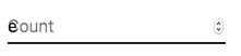
若要解決此問題,您可以強制標籤的「縮小」狀態。
<TextField slotProps={{ inputLabel: { shrink: true } }} />
或
<InputLabel shrink>Count</InputLabel>
浮動標籤
浮動標籤是絕對定位的。它不會影響頁面的版面配置。請確保輸入大於標籤才能正確顯示。
type="number"
如果您需要具有數字驗證的文字欄位,可以使用 MUI Base 的 Number Input 來代替。
您可以追蹤 這個 GitHub 問題,以追蹤將 Number Input 元件引入 Material UI 的進度。
輔助文字
輔助文字屬性會影響文字欄位的高度。如果兩個文字欄位並排放置,一個具有輔助文字,另一個沒有,它們將具有不同的高度。例如
請輸入您的姓名
這可以透過將空格字元傳遞至 helperText 屬性來修正
請輸入您的姓名
與第三方輸入程式庫整合
您可以使用第三方程式庫來格式化輸入。您必須使用 inputComponent 屬性提供 <input> 元素的自訂實作。
以下示範使用 react-imask 和 react-number-format 程式庫。相同的概念可以應用於例如 react-stripe-element。
提供的輸入元件應公開一個 ref,其值實作以下介面
interface InputElement {
  focus(): void;
  value?: string;
}
const MyInputComponent = React.forwardRef((props, ref) => {
  const { component: Component, ...other } = props;

  // implement `InputElement` interface
  React.useImperativeHandle(ref, () => ({
    focus: () => {
      // logic to focus the rendered component from 3rd party belongs here
    },
    // hiding the value e.g. react-stripe-elements
  }));

  // `Component` will be your `SomeThirdPartyComponent` from below
  return <Component {...other} />;
});

// usage
<TextField
  slotProps={{
    input: {
      inputComponent: MyInputComponent,
      inputProps: {
        component: SomeThirdPartyComponent,
      },
    },
  }}
/>;
協助工具
為了使文字欄位具有協助工具,**輸入應連結到標籤和輔助文字**。底層 DOM 節點應具有此結構
<div class="form-control">
  <label for="my-input">Email address</label>
  <input id="my-input" aria-describedby="my-helper-text" />
  <span id="my-helper-text">We'll never share your email.</span>
</div>
- 如果您使用的是
TextField元件,您只需提供唯一的id,除非您僅在用戶端使用TextField。在 UI 還原之前,沒有明確id的TextField將不會有相關聯的標籤。 - 如果您要組合元件
<FormControl>
  <InputLabel htmlFor="my-input">Email address</InputLabel>
  <Input id="my-input" aria-describedby="my-helper-text" />
  <FormHelperText id="my-helper-text">We'll never share your email.</FormHelperText>
</FormControl>
補充專案
對於更進階的用例,您或許可以利用
- react-hook-form-mui:Material UI 和 react-hook-form 的組合。
- formik-material-ui:用於將 Material UI 與 formik 搭配使用的繫結。
- mui-rff:用於將 Material UI 與 React Final Form 搭配使用的繫結。
- @ui-schema/ds-material 用於將 Material UI 與 UI Schema 搭配使用的繫結。JSON Schema 相容。
無樣式
使用 Base UI 文字欄位 以完全擁有元件的設計,無需覆寫 Material UI 或 Joy UI 樣式。此元件的無樣式版本是需要大量自訂且套件大小較小的理想選擇。
API
請參閱以下文件,以取得此處提及之元件可用的所有屬性和類別的完整參考。