從 v3 遷移到 v4
耶!v4 已經發布了!
正在尋找 v3 文件?您可以在這裡找到最新版本。
簡介
這是將您的網站從 Material UI v3 升級到 v4 的參考指南。雖然這裡涵蓋了很多內容,但您的網站可能不需要全部執行。我們會盡力讓內容易於理解,並盡可能按順序排列,以便您可以快速開始使用 v4!
為何您應該遷移
此文件頁面涵蓋從 v3 遷移到 v4 的方法。原因在 Medium 上的發布部落格文章中說明。
更新您的依賴項
您需要做的第一件事是更新您的依賴項。
更新 Material UI 版本
您需要更新您的 package.json 以使用最新版本的 Material UI。
"dependencies": {
  "@material-ui/core": "^4.0.0"
}
或執行
npm install @material-ui/core

or

yarn add @material-ui/core
更新 React 版本
React 的最低需求版本已從 react@^16.3.0 提高到 react@^16.8.0。這讓我們可以依賴 Hooks (我們不再使用 class API)。
更新 Material UI Styles 版本
如果您先前在 v3 中使用 @material-ui/styles,您需要更新您的 package.json 以使用最新版本的 Material UI Styles。
"dependencies": {
  "@material-ui/styles": "^4.0.0"
}
或執行
npm install @material-ui/styles

or

yarn add @material-ui/styles
處理重大變更
核心
- 每個組件都 forward 他們的 ref。這是透過使用
React.forwardRef()實作的。這會影響內部組件樹狀結構和顯示名稱,因此可能會破壞 shallow 或 snapshot 測試。innerRef將不再傳回對實例的 ref (如果內部組件是函式組件,則不傳回任何內容),而是傳回對其根組件的 ref。對應的 API 文件列出了根組件。
樣式
⚠️ Material UI 依賴 JSS v10。JSS v10 與 v9 不向後相容。請確保您的環境中未安裝 JSS v9。(從您的
package.json中移除react-jss可以有所幫助)。StylesProvider 組件取代了 JssProvider 組件。移除
withTheme()的第一個選項參數。(第一個參數是未來可能選項的預留位置,但從未出現。)它符合 emotion API 和 styled-components API。
-const DeepChild = withTheme()(DeepChildRaw); +const DeepChild = withTheme(DeepChildRaw);將
convertHexToRGB重新命名為hexToRgb。-import { convertHexToRgb } from '@material-ui/core/styles/colorManipulator'; +import { hexToRgb } from '@material-ui/core/styles';Scope keyframes API。您應該在您的程式碼庫中套用以下變更。這有助於隔離動畫邏輯
  rippleVisible: {
    opacity: 0.3,
-   animation: 'mui-ripple-enter 100ms cubic-bezier(0.4, 0, 0.2, 1)',
+   animation: '$mui-ripple-enter 100ms cubic-bezier(0.4, 0, 0.2, 1)',
  },
  '@keyframes mui-ripple-enter': {
    '0%': {
      opacity: 0.1,
    },
    '100%': {
      opacity: 0.3,
    },
  },
主題
theme.palette.augmentColor()方法不再對其輸入顏色執行 side effect。若要正確使用它,您必須使用傳回的值。-const background = { main: color }; -theme.palette.augmentColor(background); +const background = theme.palette.augmentColor({ main: color }); console.log({ background });您可以安全地從主題建立中移除下一個變體
typography: { - useNextVariants: true, },theme.spacing.unit用法已棄用,您可以使用新的 APIlabel: { [theme.breakpoints.up('sm')]: { - paddingTop: theme.spacing.unit * 12, + paddingTop: theme.spacing(12), }, }提示:您可以提供超過 1 個參數:
theme.spacing(1, 2) // = '8px 16px'.您可以在您的專案上使用 migration helper,使此過程更順暢。
版面配置
[Grid] 為了支援任意間距值並消除心算 8 的需求,我們正在變更間距 API
/** * Defines the space between the type `item` component. * It can only be used on a type `container` component. */ - spacing: PropTypes.oneOf([0, 8, 16, 24, 32, 40]), + spacing: PropTypes.oneOf([0, 1, 2, 3, 4, 5, 6, 7, 8, 9, 10]),接下來,您可以使用主題來實作自訂 Grid 間距轉換函式。
[Container] 從
@material-ui/lab移至@material-ui/core。-import Container from '@material-ui/lab/Container'; +import Container from '@material-ui/core/Container';
TypeScript
value 類型
標準化輸入組件的 value prop 類型以使用 unknown。這會影響 InputBase、NativeSelect、OutlinedInput、Radio、RadioGroup、Select、SelectInput、Switch、TextArea 和 TextField。
 function MySelect({ children }) {
-  const handleChange = (event: any, value: string) => {
+  const handleChange = (event: any, value: unknown) => {
     // handle value
   };

   return <Select onChange={handleChange}>{children}</Select>
 }
此變更在TypeScript 指南中有更詳細的說明
Button
[Button] 移除已棄用的按鈕變體 (flat, raised 和 fab)
-<Button variant="raised" /> +<Button variant="contained" />-<Button variant="flat" /> +<Button variant="text" />-import Button from '@material-ui/core/Button'; -<Button variant="fab" /> +import Fab from '@material-ui/core/Fab'; +<Fab />-import Button from '@material-ui/core/Button'; -<Button variant="extendedFab" /> +import Fab from '@material-ui/core/Fab'; +<Fab variant="extended" />[ButtonBase] 傳遞給
componentprop 的組件需要能夠 hold a ref。組合指南說明了遷移策略。這也適用於
BottomNavigationAction、Button、CardActionArea、Checkbox、ExpansionPanelSummary、Fab、IconButton、MenuItem、Radio、StepButton、Tab、TableSortLabel以及ListItem(如果buttonprop 為 true)。
Card
- [CardActions] 將
disableActionSpacingprop 重新命名為disableSpacing。 - [CardActions] 移除
disableActionSpacingCSS class。 - [CardActions] 將
actionCSS class 重新命名為spacing。
ClickAwayListener
- [ClickAwayListener] 隱藏 react-event-listener props。
Dialog
- [DialogActions] 將
disableActionSpacingprop 重新命名為disableSpacing。 - [DialogActions] 將
actionCSS class 重新命名為spacing。 - [DialogContentText] 使用排版變體
body1而不是subtitle1。 - [Dialog] 子組件需要能夠 hold a ref。組合指南說明了遷移策略。
Divider
[Divider] 移除已棄用的
insetprop。-<Divider inset /> +<Divider variant="inset" />
ExpansionPanel
- [ExpansionPanelActions] 將
actionCSS class 重新命名為spacing。 - [ExpansionPanel] 提高
disabled和expanded樣式規則的 CSS 特異性。 - [ExpansionPanel] 將
CollapsePropsprop 重新命名為TransitionProps。
List
[List] 重新設計列表組件以符合規範
- 使用 avatar 時,需要
ListItemAvatar組件。 - 使用左側核取方塊時,需要
ListItemIcon組件。 edge屬性應在 icon button 上設定。
- 使用 avatar 時,需要
[List]
dense不再減少List元素的頂部和底部 padding。[ListItem] 提高
disabled和focusVisible樣式規則的 CSS 特異性。
Menu
- [MenuItem] 移除 MenuItem 的固定高度。padding 和 line-height 由瀏覽器用於計算高度。
Modal
[Modal] 子組件需要能夠 hold a ref。組合指南說明了遷移策略。
這也適用於
Dialog和Popover。[Modal] 移除 Modal 組件的 classes 客製化 API (獨立使用時 bundle size 減少 -74%)。
[Modal] event.defaultPrevented 現在被忽略。即使在 key down escape 事件上呼叫
event.preventDefault(),新的邏輯也會關閉 Modal。event.preventDefault()旨在停止預設行為,例如點擊核取方塊以勾選它、點擊按鈕以提交表單,以及點擊向左箭頭以在文字輸入中移動游標等等。只有特殊的 HTML 元素才具有這些預設行為。如果您不希望在 modal 上觸發onClose事件,則應使用event.stopPropagation()。
Paper
[Paper] 降低預設 elevation。變更預設 Paper elevation 以符合 Card 和 Expansion Panel
-<Paper /> +<Paper elevation={2} />這也會影響
ExpansionPanel。
Portal
- [Portal] 當使用
disablePortal時,子組件需要能夠 hold a ref。組合指南說明了遷移策略。
Slide
- [Slide] 子組件需要能夠 hold a ref。組合指南說明了遷移策略。
Slider
[Slider] 從
@material-ui/lab移至@material-ui/core。-import Slider from '@material-ui/lab/Slider' +import Slider from '@material-ui/core/Slider'
Switch
[Switch] 重構實作以使其更易於覆寫樣式。重新命名 class name 以符合規範措辭
-icon
-bar
+thumb
+track
Snackbar
[Snackbar] 符合新的規範。
- 變更尺寸
- 將預設 transition 從
Slide變更為Grow。
SvgIcon
[SvgIcon] 重新命名 nativeColor -> htmlColor。React 使用
forHTML 屬性解決了相同的問題,他們已決定將 prop 稱為htmlFor。此變更遵循相同的邏輯。-<AddIcon nativeColor="#fff" /> +<AddIcon htmlColor="#fff" />
Tabs
[Tab] 移除
labelContainer、label和labelWrappedclass key 以簡化。這讓我們得以移除 2 個中間 DOM 元素。您應該能夠將自訂樣式移動到rootclass key。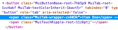
[Tabs] 移除已棄用的 fullWidth 和 scrollable props
-<Tabs fullWidth scrollable />
+<Tabs variant="scrollable" />
Table
[TableCell] 移除已棄用的
numeric屬性-<TableCell numeric>{row.calories}</TableCell> +<TableCell align="right">{row.calories}</TableCell>[TableRow] 移除固定的高度 CSS 屬性。cell 高度由瀏覽器使用 padding 和 line-height 計算。
[TableCell] 將
dense模式移至不同的屬性-<TableCell padding="dense" /> +<TableCell size="small" />[TablePagination] 組件不再嘗試修正無效的 (
page、count、rowsPerPage) 屬性組合。而是發出警告。
TextField
[InputLabel] 您應該能夠使用 InputLabel 組件的 CSS API 覆寫 FormLabel 組件的所有樣式。
FormLabelClasses屬性已被移除。<InputLabel - FormLabelClasses={{ asterisk: 'bar' }} + classes={{ asterisk: 'bar' }} > Foo </InputLabel>[InputBase] 變更預設 box sizing model。它現在使用以下 CSS
box-sizing: border-box;這解決了
fullWidthprop 的問題。[InputBase] 從
InputBase移除inputTypeclass。
Tooltip
- [Tooltip] 子組件需要能夠 hold a ref。組合指南說明了遷移策略。
- [Tooltip] 僅在 focus-visible focus 之後出現,而不是任何 focus。
Typography
[Typography] 移除已棄用的排版變體。您可以透過執行以下替換來升級
- display4 => h1
- display3 => h2
- display2 => h3
- display1 => h4
- headline => h5
- title => h6
- subheading => subtitle1
- body2 => body1
- body1 (預設) => body2 (預設)
[Typography] 移除武斷的
display: block預設排版樣式。您可以使用新的display?: 'initial' | 'inline' | 'block';屬性。[Typography] 將
headlineMapping屬性重新命名為variantMapping,以更好地與其用途對齊。-<Typography headlineMapping={headlineMapping}> +<Typography variantMapping={variantMapping}>[Typography] 將預設變體從
body2變更為body1。16px 的字體大小比 14px 更適合作為預設值。Bootstrap、material.io,甚至文件都使用 16px 作為預設字體大小。像 Ant Design 使用的 14px 是可以理解的,因為中文使用者有不同的字母系統。建議 12px 作為日文的預設字體大小。[Typography] 從排版變體中移除預設顏色。顏色在大多數情況下應該繼承。這是網頁的預設行為。
[Typography] 根據 此討論串 的邏輯,將
color="default"重新命名為color="initial"。應避免使用default,它缺乏語義。
Node
- 放棄 node 6 支援,您應該升級到 node 8。
UMD
此變更簡化了 Material UI 與 CDN 的使用
const { Button, TextField, -} = window['material-ui']; +} = MaterialUI;它與其他 React 專案一致
- material-ui => MaterialUI
- react-dom => ReactDOM
- prop-types => PropTypes