Material UI Sync 外掛程式 🧪
Sync 是一款 Figma 外掛程式,可直接從設計稿產生 Material UI 主題到程式碼。
簡介
Material UI Sync 是一款 Figma 外掛程式,可讓您從 Material UI for Figma 設計套件 產生主題。
Sync 與 Material UI for Figma 設計套件 v5.16.0 及更高版本搭配使用。
執行外掛程式
如果您沒有安裝 完整且最新版本 的 Material UI for Figma 設計套件,您可以改用 社群版本 來測試此外掛程式。
在 Figma 中安裝並開啟後,前往社群標籤上的 Material UI Sync 外掛程式頁面,然後按一下在…中開啟並選取 Material UI for Figma 設計套件。
客製化設計令牌
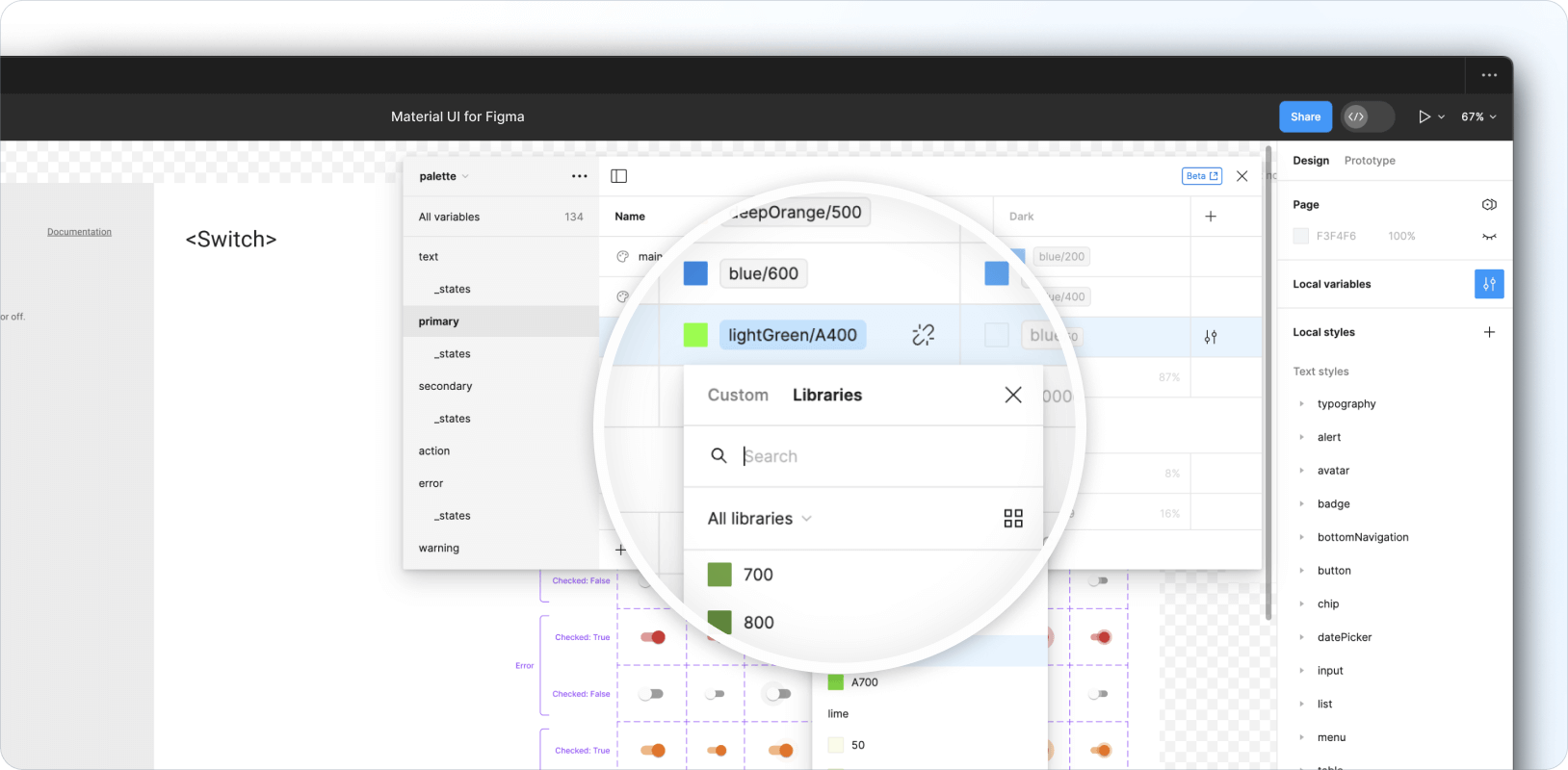
設計令牌定義在設計套件的 本機變數集合 中,包含調色盤、斷點、形狀和間距令牌。排版和陰影相關的令牌可在 本機樣式集合 中找到。
修改現有令牌
設計套件完整載入了設計令牌,這些令牌對應到 Material UI React 函式庫的預設主題。
若要客製化現有令牌,請按一下如下所示的篩選器圖示,開啟 本機變數模組。視需要調整集合中可用的任何變數 (例如調色盤、斷點、形狀和間距)。
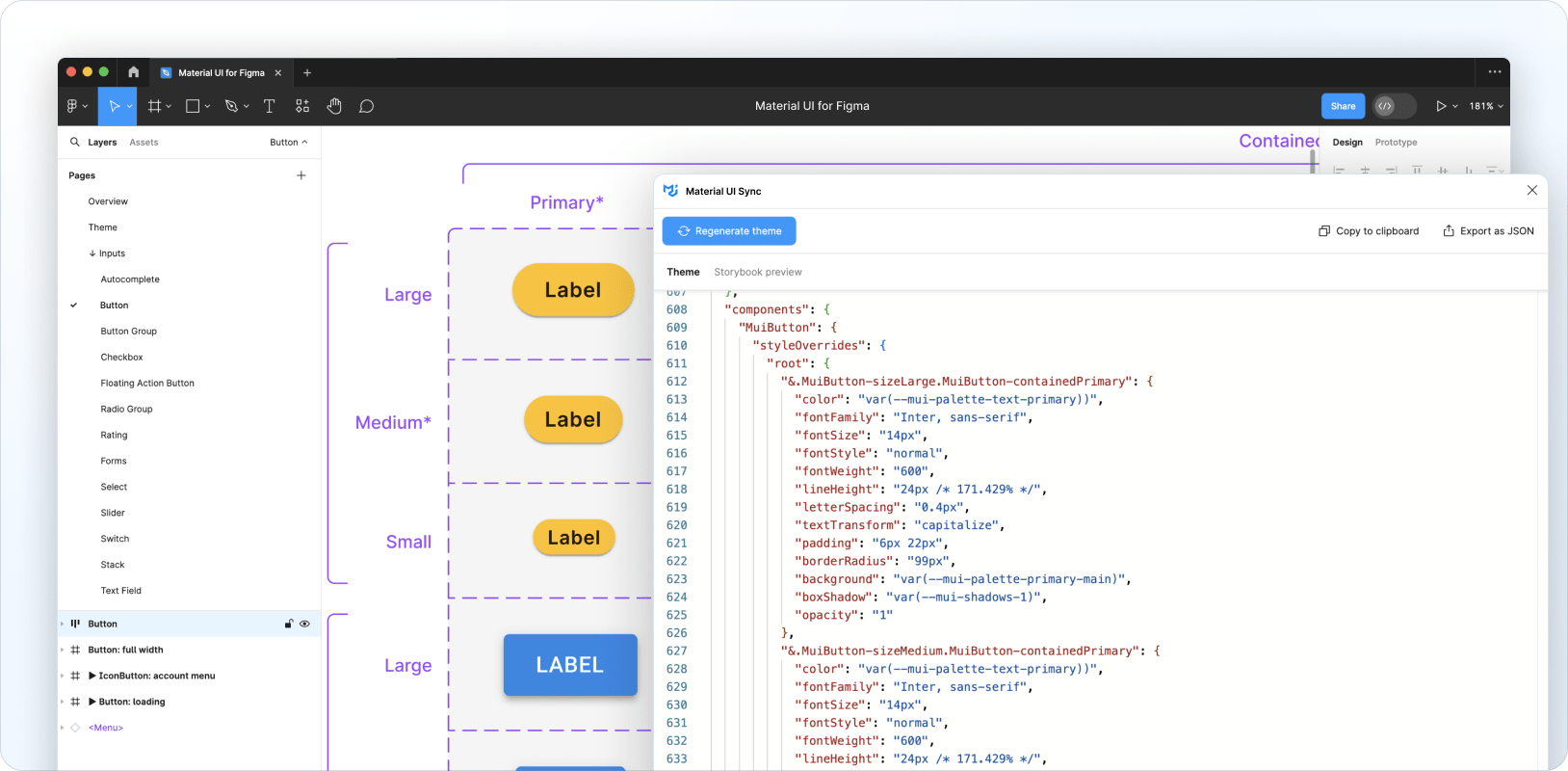
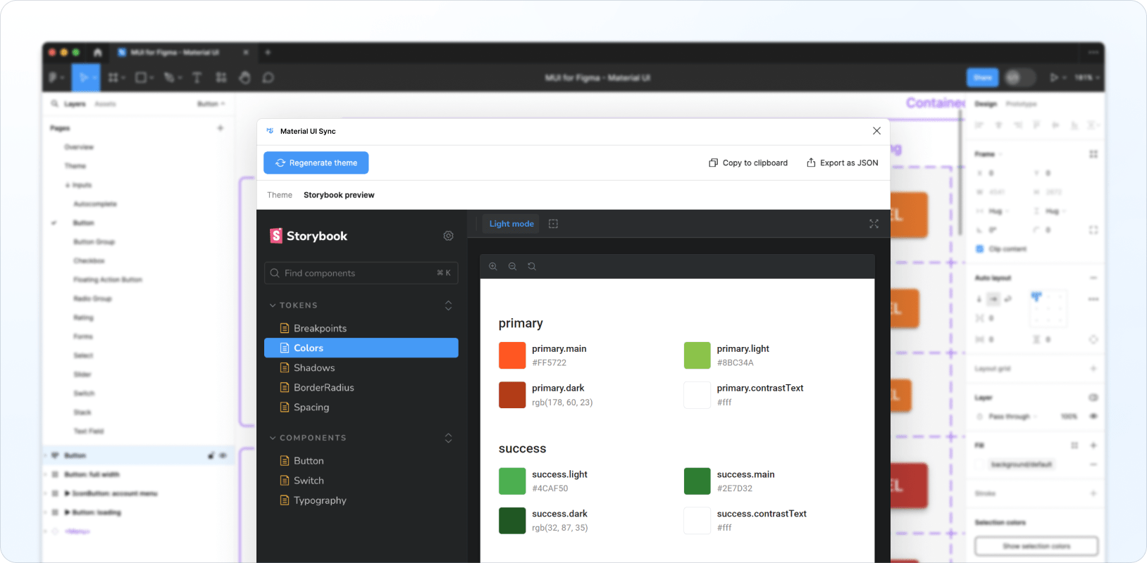
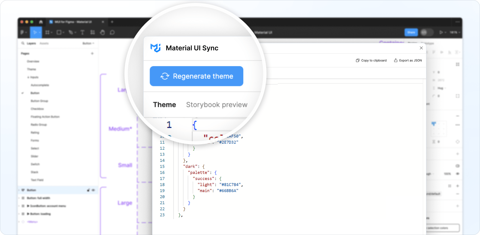
然後開啟 Material UI Sync 外掛程式,然後按一下產生主題。

包含修改後令牌的主題會產生並顯示在外掛程式的主題標籤中。
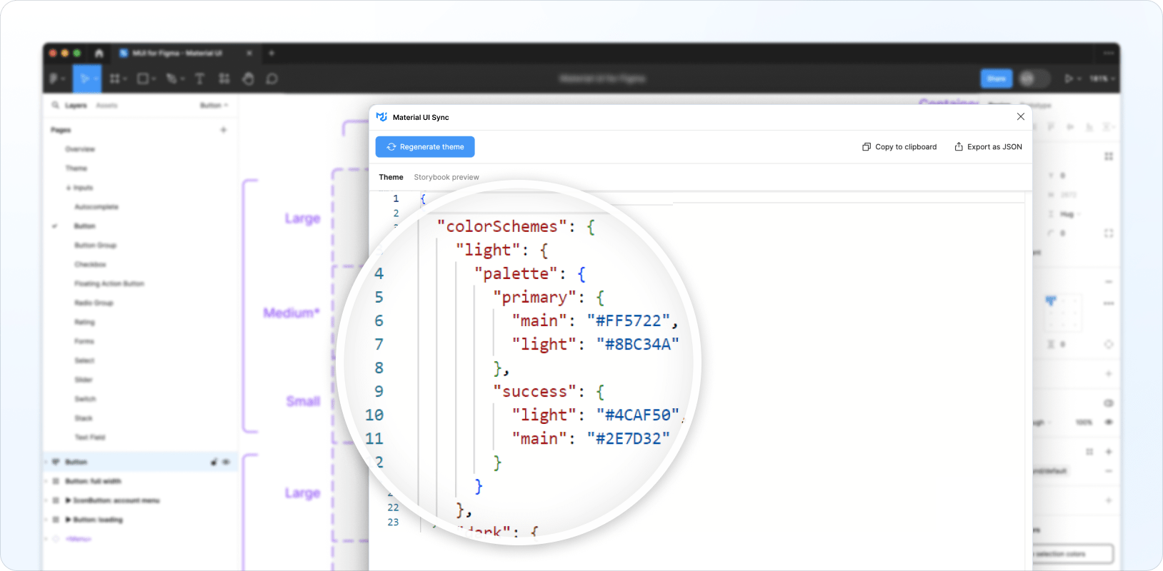
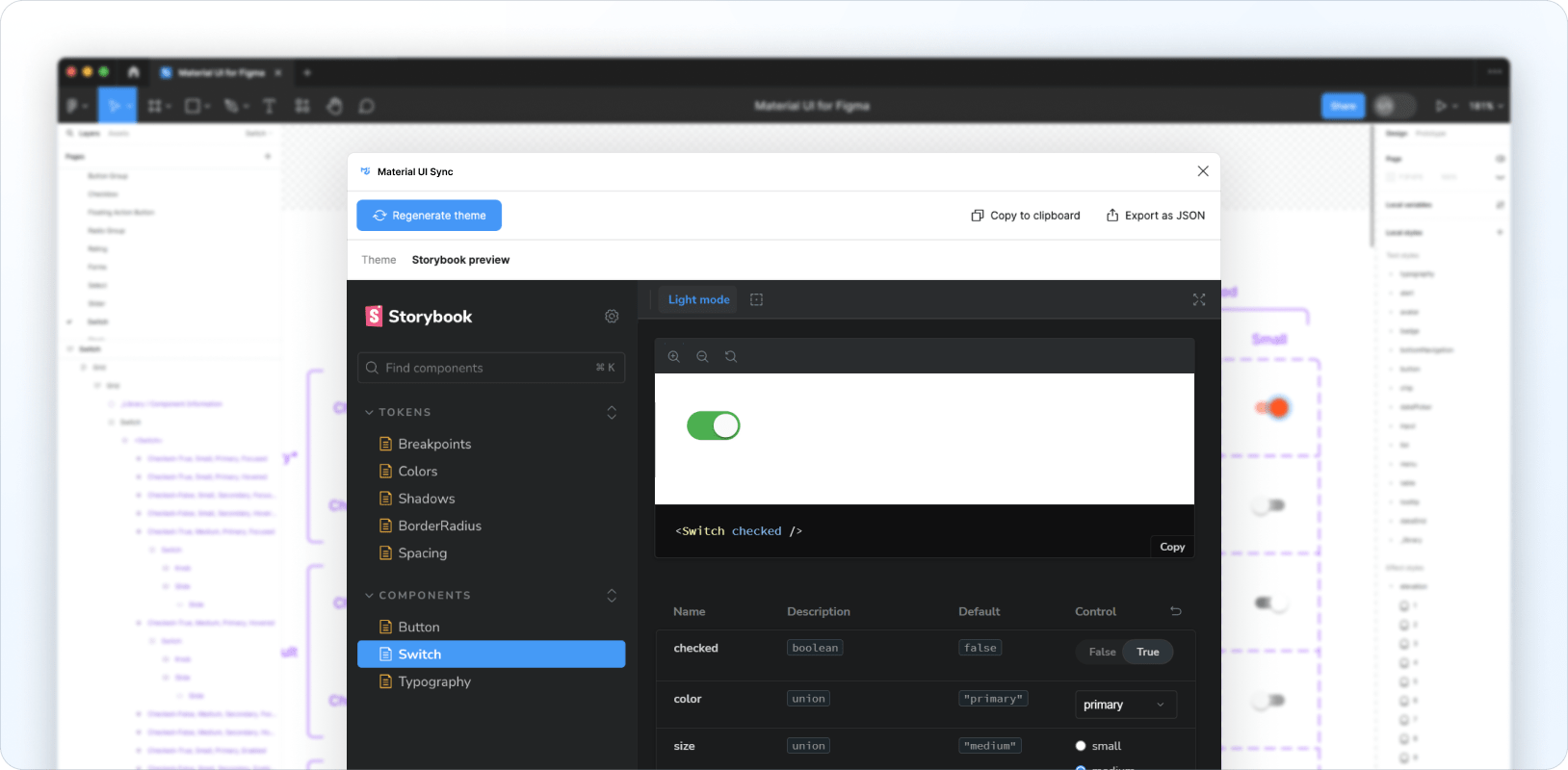
您也可以導覽至 Storybook 預覽標籤,預覽產生的主題和客製化的令牌。
新增令牌
您可以透過將新變數新增至現有的本機變數集合,或將新的高程和排版樣式新增至本機樣式集合,使用您自己的變數來擴充現有的令牌集。新增自訂令牌後,按一下重新產生主題,將這些令牌包含在您的主題中。
客製化元件
Sync 外掛程式也可以為客製化元件產生主題樣式,讓您完全變更其外觀和風格,並從 Figma 內部建立您的自訂設計系統。
舉例來說,以下說明如何客製化 Switch 元件的已選取狀態、中等尺寸和主要顏色,以複製 iOS 的外觀和風格
Sync 外掛程式會為客製化的 Switch 產生以下主題程式碼
{
  components: {
    MuiSwitch: {
      styleOverrides: {
        root: {
          '&.MuiSwitch-sizeMedium:has(.MuiSwitch-colorPrimary)': {
            '&:has(.Mui-checked):not(:has(.Mui-disabled)):not(:has(.Mui-focusVisible))':
              {
                width: '40px',
                height: '21px',
                padding: '0',
                '& .MuiSwitch-switchBase': {
                  transform: 'translateX(19px) translateY(2px)',
                  padding: '0',
                  '& .MuiSwitch-thumb': {
                    width: '17px',
                    height: '17px',
                    background: '#FAFAFA',
                  },
                  '& + .MuiSwitch-track': {
                    width: '38px',
                    height: '21px',
                    background: 'var(--mui-palette-success-light)',
                    opacity: '1',
                  },
                },
              },
          },
        },
      },
    },
  },
}
產生的主題會鎖定對應於上述特定 Switch 設定的類別,因此只有在 Material UI 元件的 props 和狀態與客製化的 Figma 元件的 props 和狀態相符時,才會套用樣式。
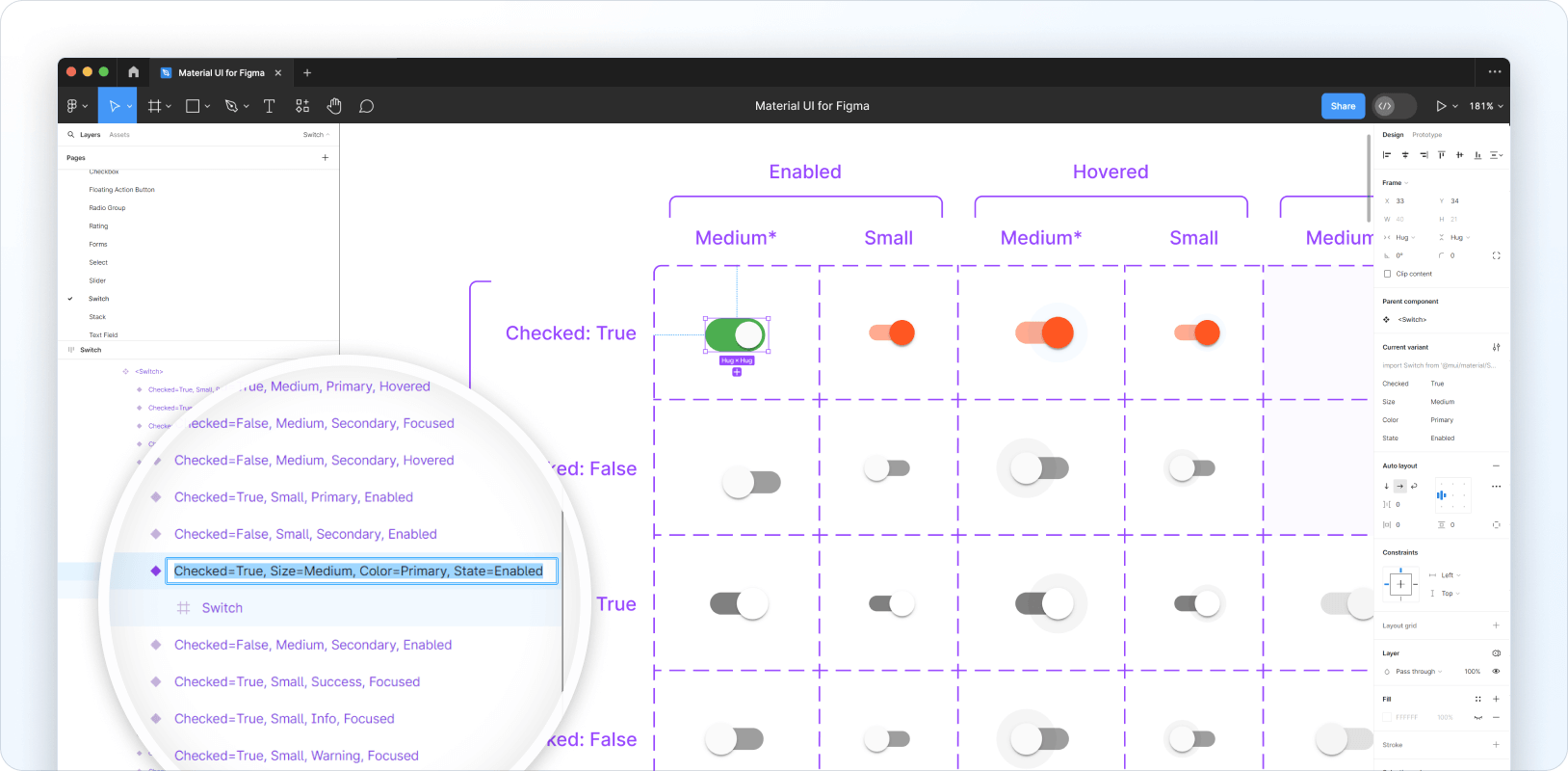
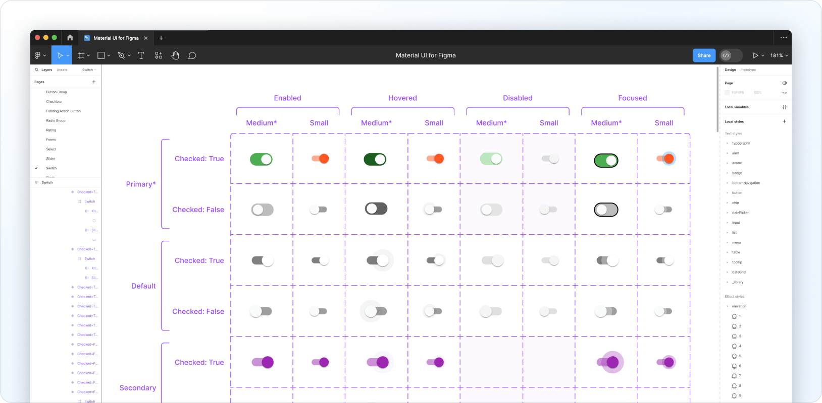
若要客製化其他狀態,您需要按照以下步驟將所需的設計變更套用至 Figma 中的每個變體
- 客製化單一「基本」變體,例如,處於已選取狀態、中等尺寸和主要顏色的 Switch 元件。
- 複製此變體並重新命名,以鎖定您想要客製化的下一個變體,例如,將
Checked=True、Size=Medium、Color=Primary、State=Enabled的複製版本重新命名為Checked=False、Size=Medium、Color=Primary、State=Enabled。 - 刪除相同變體的舊版本。
- 將新版本移動到變體格線中的正確方格。
- 對變體的子圖層進行必要的樣式調整。
針對您要客製化的每個變體重複此流程。以下範例說明其外觀
從這裡您可以執行 Sync 以產生新主題,以下是從上述範例產生的內容
{
  components: {
    MuiSwitch: {
      styleOverrides: {
        root: {
          '&.MuiSwitch-sizeMedium:has(.MuiSwitch-colorPrimary)': {
            width: '40px',
            height: '21px',
            padding: '0',
            '& .MuiSwitch-switchBase': {
              padding: '0',
              '& .MuiSwitch-thumb': {
                width: '17px',
                height: '17px',
                background: '#FAFAFA',
              },
              '& + .MuiSwitch-track': {
                width: '38px',
                height: '21px',
                borderRadius: '100px',
                opacity: '1',
              },
            },
            '&:not(:has(.Mui-checked)):not(:has(.Mui-disabled)):not(:has(.Mui-focusVisible))': {
              '& .MuiSwitch-switchBase': {
                transform: 'translateX(3px) translateY(2px)',
                '& + .MuiSwitch-track': {
                  background: '#BDBDBD',
                },
              },
            },
            '&:not(:has(.Mui-checked)):has(.Mui-disabled):not(:has(.Mui-focusVisible))': {
              '& .MuiSwitch-switchBase': {
                transform: 'translateX(3px) translateY(2px)',
                '& + .MuiSwitch-track': {
                  background: 'rgba(229, 229, 229, 0.99)',
                },
              },
            },
            '&:not(:has(.Mui-checked)):not(:has(.Mui-disabled)):has(.Mui-focusVisible)': {
              '& .MuiSwitch-switchBase': {
                transform: 'translateX(3px) translateY(2px)',
                '& + .MuiSwitch-track': {
                  border: '1px solid #000',
                  background: '#BDBDBD',
                },
              },
            },
            '&:has(.Mui-checked):has(.Mui-disabled):not(:has(.Mui-focusVisible))': {
              '& .MuiSwitch-switchBase': {
                transform: 'translateX(19px) translateY(2px)',
                '& + .MuiSwitch-track': {
                  background: 'rgba(187, 231, 188, 0.99)',
                },
              },
            },
            '&:not(:has(.Mui-checked)):not(:has(.Mui-disabled)):not(:has(.Mui-focusVisible)):hover': {
              '& .MuiSwitch-switchBase': {
                transform: 'translateX(3px) translateY(2px)',
                '& + .MuiSwitch-track': {
                  background: '#616161',
                },
              },
            },
            '&:has(.Mui-checked):not(:has(.Mui-disabled)):not(:has(.Mui-focusVisible))': {
              '& .MuiSwitch-switchBase': {
                transform: 'translateX(19px) translateY(2px)',
                '& + .MuiSwitch-track': {
                  background: 'var(--mui-palette-success-light)',
                },
              },
            },
            '&:has(.Mui-checked):not(:has(.Mui-disabled)):not(:has(.Mui-focusVisible)):hover': {
              '& .MuiSwitch-switchBase': {
                transform: 'translateX(19px) translateY(2px)',
                '& + .MuiSwitch-track': {
                  background: 'var(--mui-palette-success-dark)',
                },
              },
            },
            '&:has(.Mui-checked):not(:has(.Mui-disabled)):has(.Mui-focusVisible)': {
              '& .MuiSwitch-switchBase': {
                transform: 'translateX(19px) translateY(2px)',
                '& + .MuiSwitch-track': {
                  border: '1px solid #000',
                  background: 'var(--mui-palette-success-light)',
                },
              },
            },
          },
        },
      },
    },
  },
}
您也可以查看 Storybook 預覽,以測試 Material UI 版本的元件。
使用產生的主題
以下範例說明如何將 Sync 產生的主題新增至您的程式碼庫
import { createTheme, ThemeProvider } from '@mui/material/styles';

const theme = createTheme({
  cssVariables: true,
  shape: {
    borderRadiusRound: 999,
  },
  components: {
    MuiSwitch: {
      styleOverrides: {
        root: {
          '&.MuiSwitch-sizeMedium:has(.MuiSwitch-colorPrimary)': {
            '&:has(.Mui-checked):not(:has(.Mui-disabled)):not(:has(.Mui-focusVisible))':
              {
                width: '40px',
                height: '21px',
                padding: '0',
                '& .MuiSwitch-switchBase': {
                  transform: 'translateX(19px) translateY(2px)',
                  padding: '0',
                  '& .MuiSwitch-thumb': {
                    width: '17px',
                    height: '17px',
                    background: '#FAFAFA',
                  },
                  '& + .MuiSwitch-track': {
                    width: '38px',
                    height: '21px',
                    background: 'var(--mui-palette-success-light)',
                    borderRadius: 'var(--mui-shape-borderRadiusRound)',
                    opacity: '1',
                  },
                },
              },
          },
        },
      },
    },
  },
});

export default function MyApp(props) {
  const { Component, pageProps } = props;

  return (
    <ThemeProvider theme={theme}>
      <Component {...pageProps} />
    </ThemeProvider>
  );
}
意見回饋和錯誤報告
如果您有任何意見回饋,我們很樂意聽取您的意見。