


世界一流的產品團隊信任 MUI,為開發者和使用者提供無與倫比的體驗。
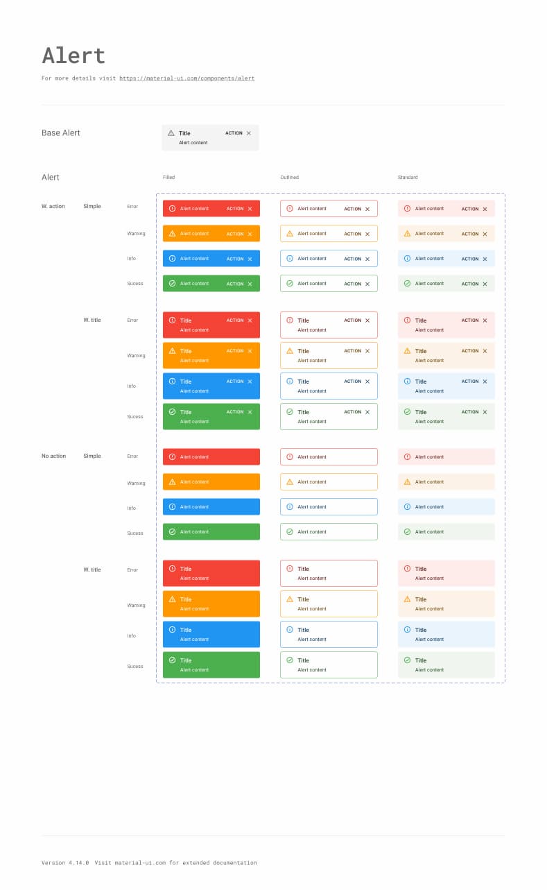
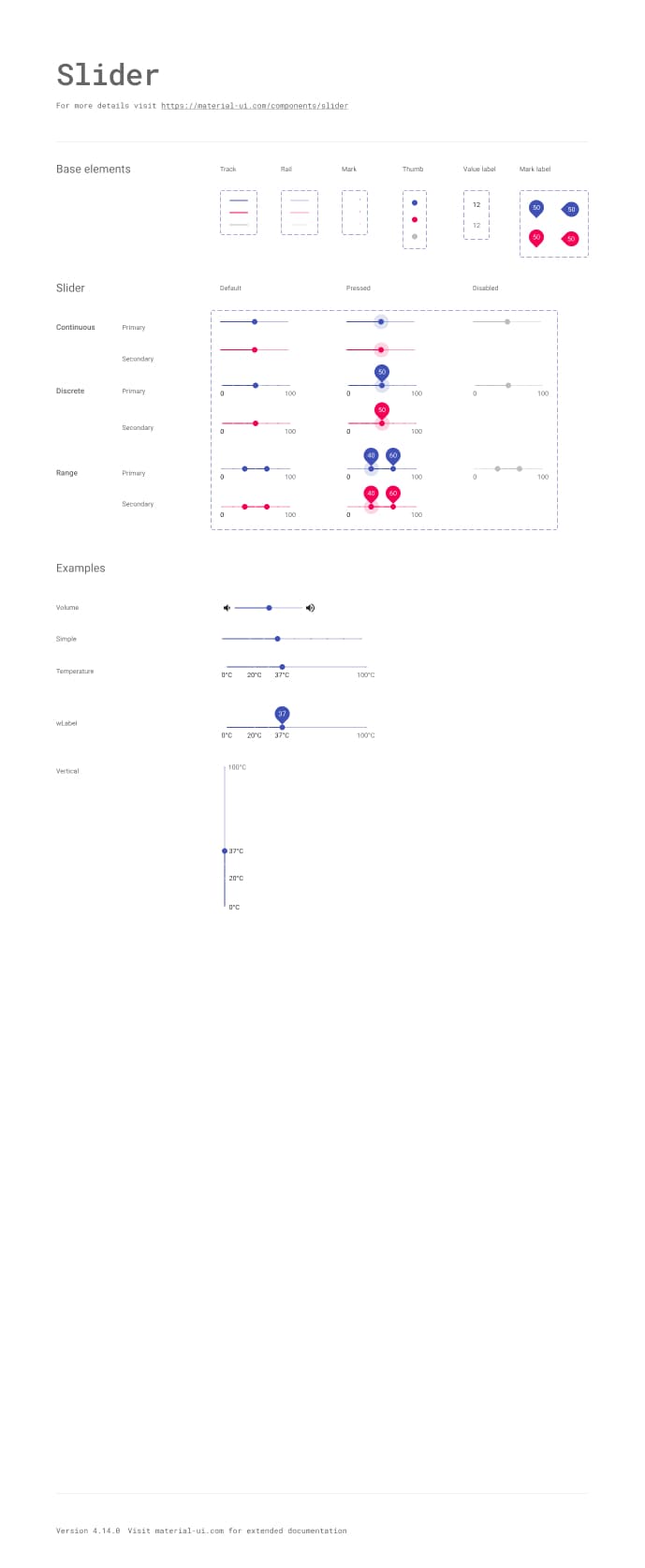
組件庫
40 多個 建構區塊組件
一絲不苟地實作 Material Design;每個 Material UI 組件都符合外觀和功能的最高標準。
<Button variant="text" startIcon={<ShoppingCartRounded />}>
  Add item
</Button>
<Button variant="contained" startIcon={<ShoppingCartRounded />}>
  Add item
</Button>
<Button variant="outlined" startIcon={<ShoppingCartRounded />}>
  Add item
</Button>
主題設定
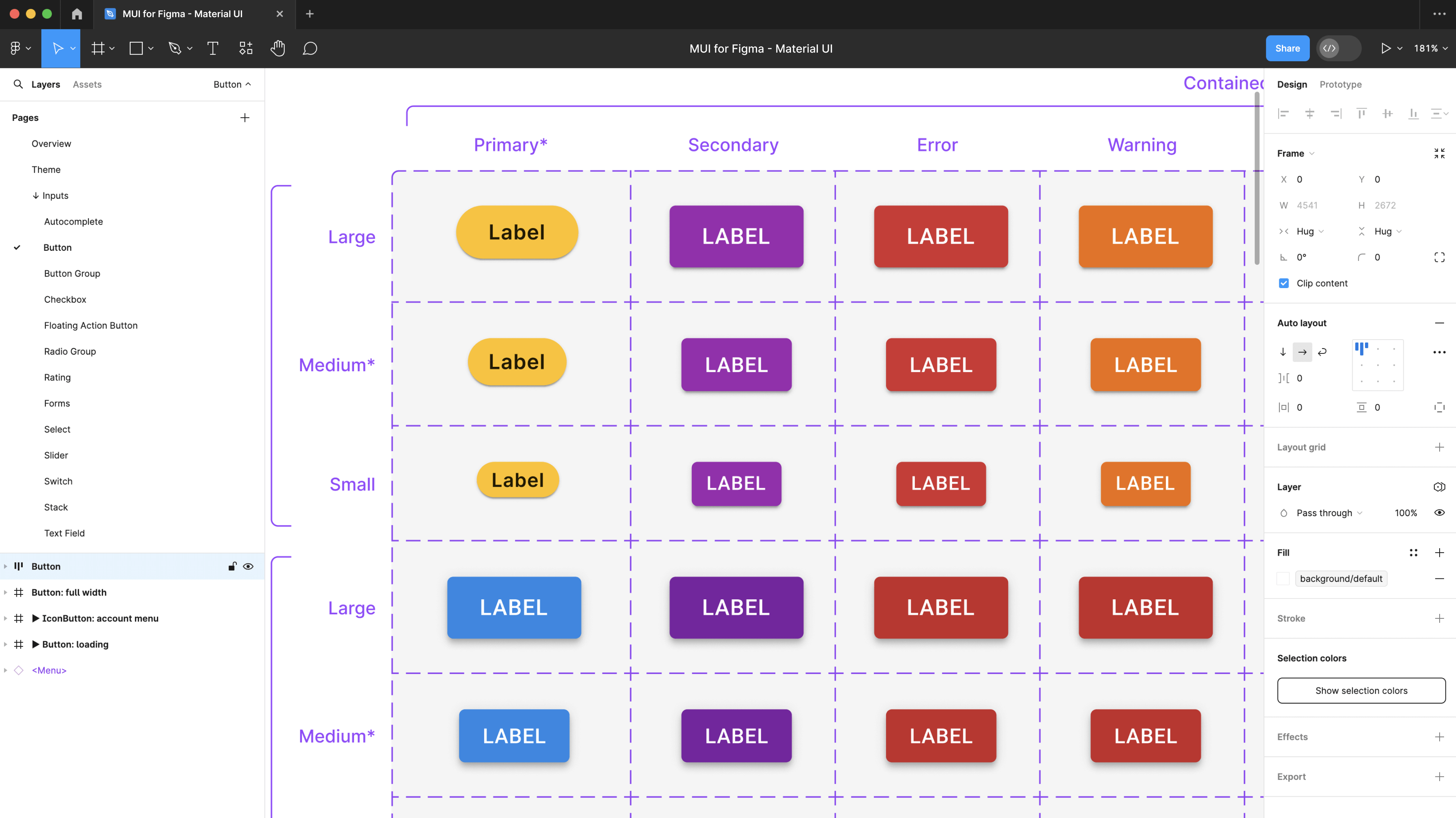
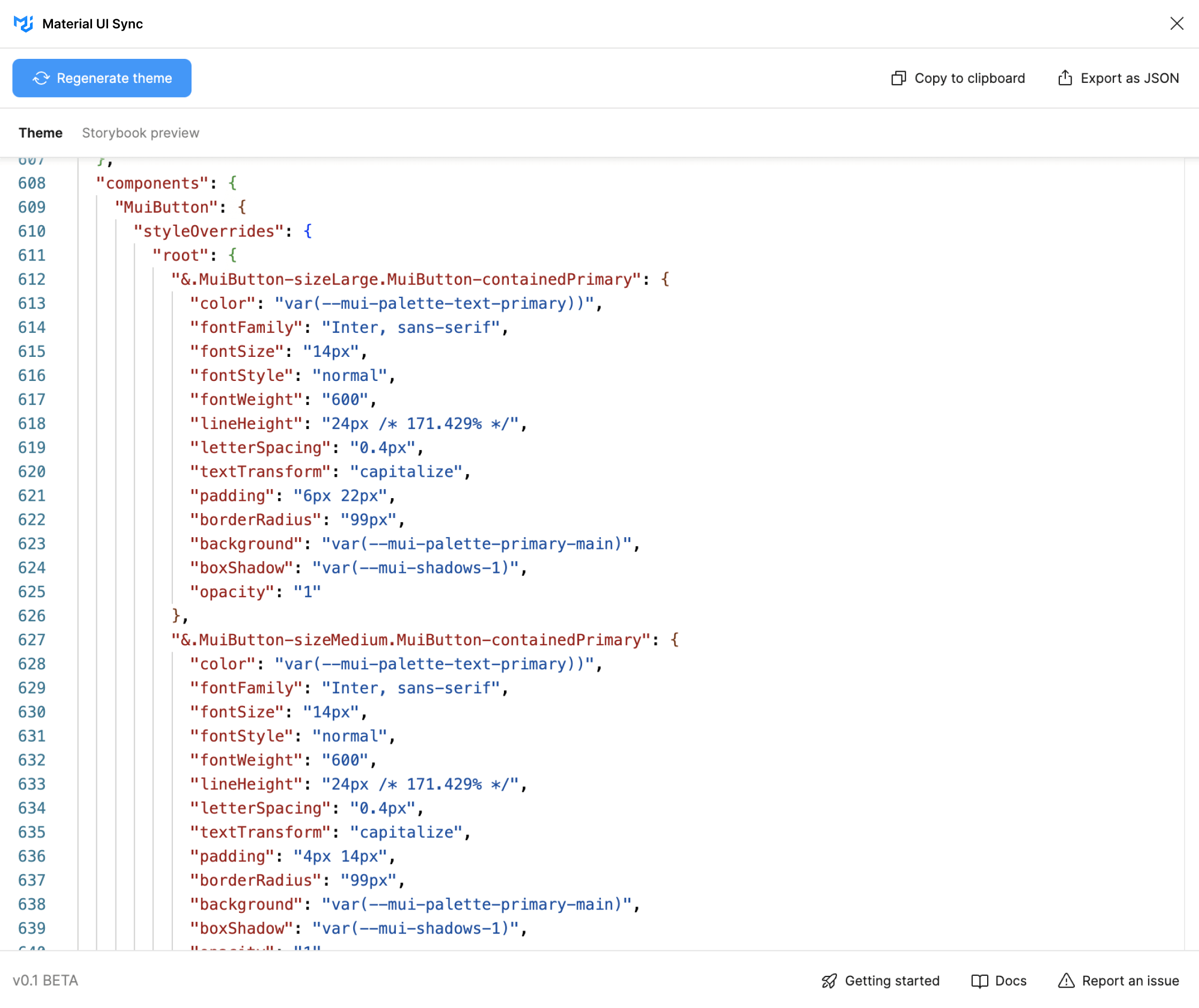
建構 您的設計系統,完全如您所願
從 Material Design 快速開始,或使用進階主題設定功能,輕鬆地根據您的需求調整組件。
自訂主題
主題設定讓您可以使用品牌的設計 Tokens,輕鬆使組件反映其外觀和風格。Material Design
每個組件都隨附 Google 經過考驗和測試的設計系統,隨時可用。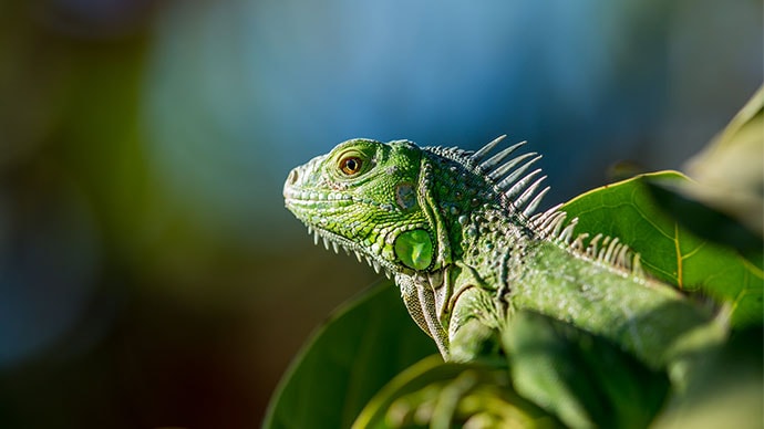
沉思的爬蟲類
大自然的聲音<Card
variant="outlined"
sx={{ p: 2,
width: { xs: '100%', sm: 'auto' },
display: 'flex',
flexDirection: { xs: 'column', sm: 'row' },
alignItems: 'center',
gap: 2,
}}
>
<CardMedia
component="img"
width="100"
height="100"
alt="Contemplative Reptile album cover"
src="/images/contemplative-reptile.jpg"
sx={{ width: { xs: '100%', sm: 100 },
}}
/>
<Stack direction="column" alignItems="center" spacing={1} useFlexGap>
<div>
<Typography color="text.primary" fontWeight="semiBold">
Contemplative Reptile
</Typography>
<Typography
variant="caption"
color="text.secondary"
fontWeight="medium"
textAlign="center"
sx={{ width: '100%' }}
>
Sounds of Nature
</Typography>
</div>
<Stack direction="row" alignItems="center" spacing={1} useFlexGap>
<IconButton aria-label="Shuffle" disabled size="small">
<ShuffleRoundedIcon fontSize="small" />
</IconButton>
<IconButton aria-label="Fast rewind" disabled size="small">
<FastRewindRounded fontSize="small" />
</IconButton>
<IconButton
aria-label={paused ? 'Play music' : 'Pause music'}
onClick={() => setPaused((val) => !val)}
sx={{ mx: 1 }}
>
{paused ? <PlayArrowRounded /> : <PauseRounded />}
</IconButton>
<IconButton aria-label="Fast forward" disabled size="small">
<FastForwardRounded fontSize="small" />
</IconButton>
<IconButton aria-label="Loop music" disabled size="small">
<LoopRoundedIcon fontSize="small" />
</IconButton>
</Stack>
</Stack>
</Card>樣式設定
使用 CSS 工具 快速新增和調整任何樣式
CSS 工具讓您在設定任何組件樣式時,都能更快地行動並獲得流暢的開發者體驗。
善用您主題的 Tokens
針對任何 CSS 屬性,輕鬆使用在主題中定義的設計 Tokens。無需切換情境
樣式設定和組件用法都在同一個地方,就在您需要它們的地方。系統屬性內的響應式樣式
用於編寫 CSS 媒體查詢的優雅 API,可與您的主題斷點匹配。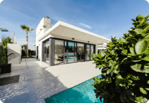
美國亞利桑那州鳳凰城大街 123 號
28 萬美元 - 31 萬美元
分數:85%
<Card
  variant="outlined"
  sx={{ p: 2, display: 'flex', flexWrap: 'wrap', zIndex: 1 }}
>
  <CardMedia
    component="img"
    width="100"
    height="100"
    alt="123 Main St, Phoenix, AZ cover"
    src="/images/real-estate.png"
    sx={{
      borderRadius: '6px',
      width: { xs: '100%', sm: 100 },
    }}
  />
  <Box sx={{ alignSelf: 'center', ml: 2 }}>
    <Typography variant="body2" color="text.secondary" fontWeight="regular">
      123 Main St, Phoenix, AZ, USA
    </Typography>
    <Typography fontWeight="bold" noWrap gutterBottom>
      $280k - $310k
    </Typography>
    <Chip
      size="small"
      variant="outlined"
      icon={<InfoRounded />}
      label="Confidence score: 85%"
      sx={(theme) => ({
        '.MuiChip-icon': { fontSize: 16, ml: '4px', color: 'success.500' },
        bgcolor: 'success.50',
        borderColor: 'success.100',
        color: 'success.900',
        ...theme.applyDarkStyles({
          bgcolor: 'primaryDark.700',
          color: 'success.200',
          borderColor: 'success.900',
        }),
      })}
    />
  </Box>
</Card>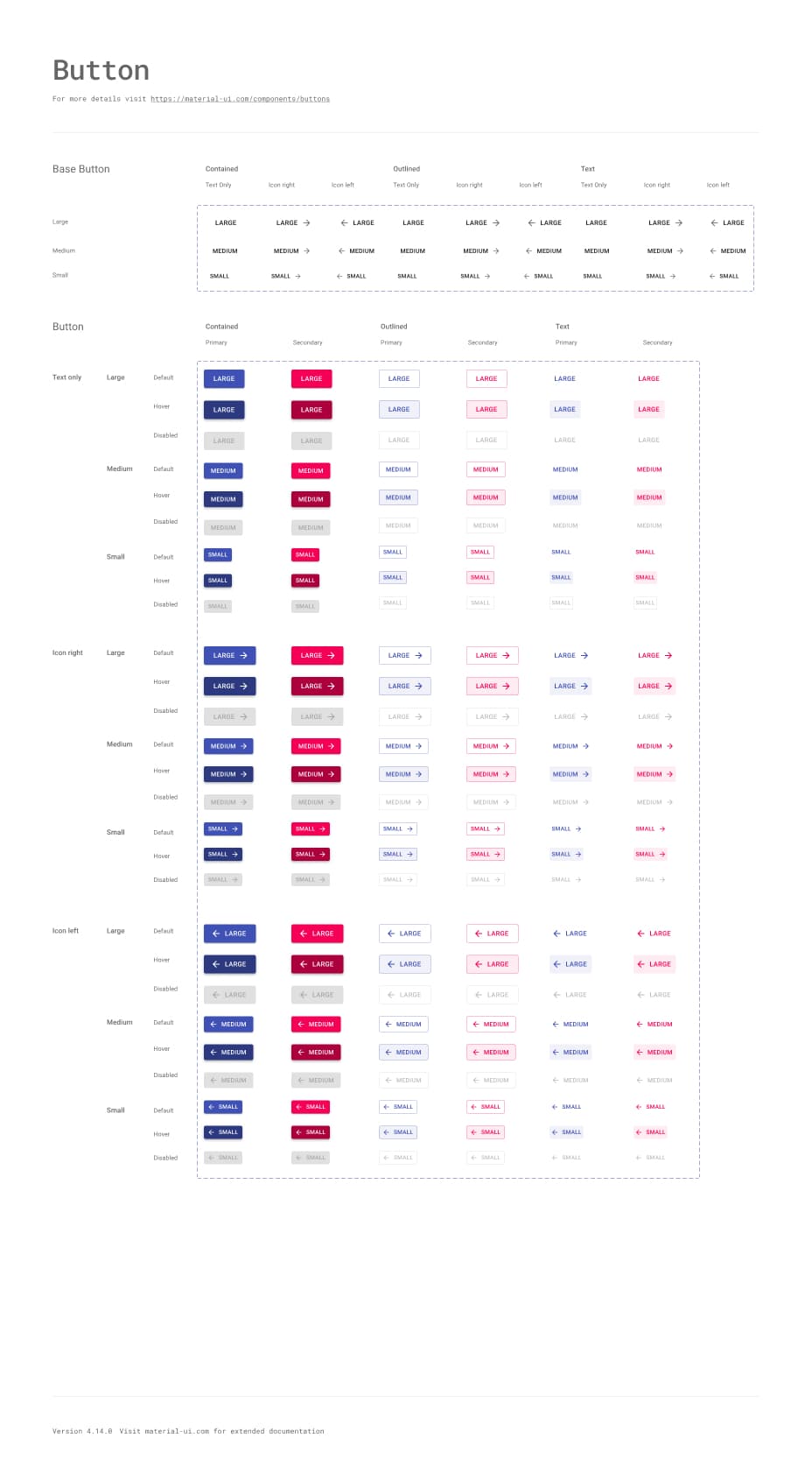
Material UI 與 MUI Base 的比較
Material UI 實作 Google 的 Material Design,而 MUI Base 具有許多相同的組件,但沒有 Material Design 實作。
它是否支援 Material Design 3?
Material UI 目前採用 Material Design 2。您可以關注 這個 GitHub issue 以取得未來與設計相關的更新。